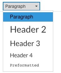
When creating new content in the Canvas Rich Content Editor, structure content with headings so that all users can understand and navigate your content, including individuals with blindness or low vision who use screen reader technology.
Why structure your content?
No one enjoys having to read a large block of unorganized text. When sighted users access a new web page, they often visually skim the page to find large or bolded text used to organize and structure the web page content. This helps readers skip straight to the parts that they are interested in, as well as letting them organize the subsections of the topic more clearly in their mind.
Screen reader users do this as well, but instead of visually searching for large or bold text, they use screen reader software to search through the page for headings that communicate the page structure and organization. These headings allow them to build a mental map of the page which helps them find what they need more quickly.
How do you structure your content?
For sighted users, content headings are typically identified by their large, bolded, and/or underlined text.
However, screen reader technology does not interpret text size and weight the way that sighted readers do with their eyes. As a result, simply bolding or enlarging text does not communicate the importance of that text to a screen reader user.
Instead, screen reader technology relies on HTML heading tags to help users navigate through a page. These tags can be added in the Canvas Rich Content Editor by highlighting your text and selecting an appropriate heading level using the Paragraph drop-down menu.

Headings should be used to structure the page content hierarchically. Within Canvas, the page title is automatically tagged as a Header 1, which is the highest or broadest heading level. The most important subjects in your content should be tagged as Header 2, and then the subsections can be tagged as Header 3, and so on.
Headings should never skip a level going down; for example, you should not put a Header 4 directly underneath a Header 2. However, skipping levels on the way up the hierarchy (i.e., skipping from Header 4 to Header 2) is acceptable.
The following is an example of proper page structure:
- H2: Courses
- H3: Undergraduate Courses
- H4: Required Courses
- H4: Optional Courses
- H3: Graduate Courses
- H4: Required Courses
- H4: Optional Courses
- H3: Undergraduate Courses
- H2: Faculty