What is Cidi Labs?
Cidi Labs DesignPlus is a suite of tools available within Canvas. It expands HTML design options in Canvas and allows you to create more engaging and aesthetically pleasing online course environments in the Canvas LMS.
Cidi Labs DesignPlus tools include:
- The Sidebar (both legacy and new) / Content Editor Toolbox: Customize colors, layout and other design elements in Announcements, Assignment and Quiz instructions, and course Pages, including course homepage.
- Multi-Tool: Customize the appearance of the Modules page, bulk manage and organize Modules, build assignment templates, and bulk edit all dates associated with your Canvas course.
- Upload/Embed Image tool: Edit, resize and upload images to your Canvas course. This tool is also available to students.
Videos on this page give a brief demo of each tool.
The new DesignPlus sidebar is available as of Fall 2024. Check out this page for more information: New DesignPlus Sidebar.
Find Cidi Labs Design Tools in Canvas
Cidi Labs Design Tools are available to all Canvas users who have editing access in a course (e.g., instructors, TAs, course designers).
Content Editor Toolbox
To launch the Content Editor Toolbox, use keyboard shortcut alt+shift+d for Windows or option+shift+d for Macs when editing a content page (you have to be in edit mode in order to activate Content Editor Toolbox). The Content Editor Toolbox will appear on the right side of your Canvas window.
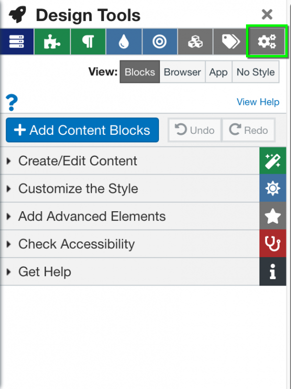
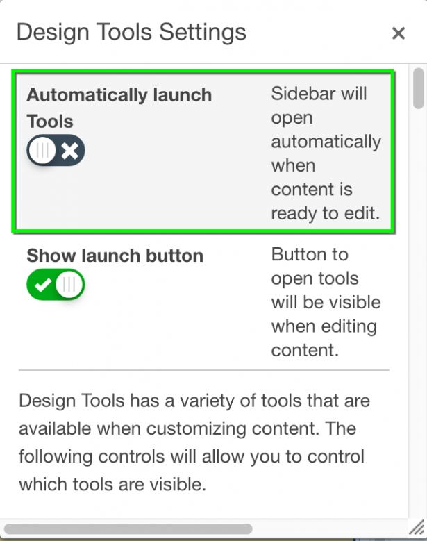
After the first activation, you can set the Content Editor tools to launch automatically: select the gear icon at the top of the Cidi Labs toolbar (see below, left), then change the top setting to Automatically launch Design Tools (see below, right).
Multi-Tool
Upload/Embed Image Tool
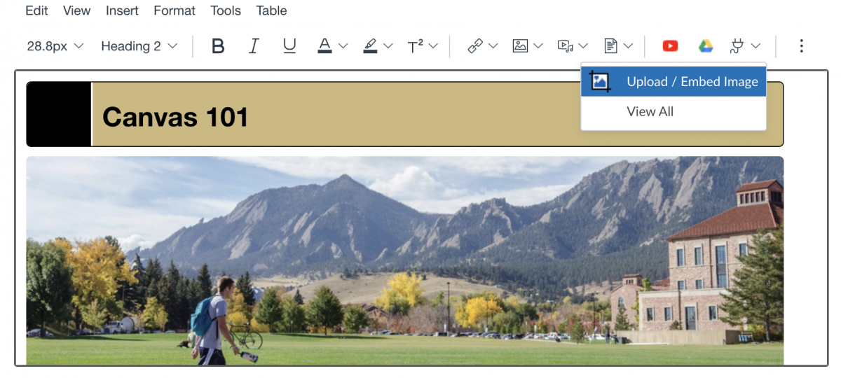
The Upload/Embed Image tool is located in the Canvas Rich Content Editor toolbar under More External Tools (blue downward arrow icon). Please Note: The Upload/Embed Image tool is also available to students anywhere they have access to the Rich Content Editor.
Homepage Design Recommendations
Interested in designing your Canvas course homepage with Cidi Labs? Review the following homepage design recommendations for some helpful tips. These recommendations are based on web navigation research-based best practices, student surveys of 168 students in three CU courses, and in-depth user experience testing conducted in the Cidi Labs Template Design & User Testing project. Principles of web navigation are taken largely from James Kalbach's Designing Web Navigation (2007).
General
- Be mindful of your students' cognitive load. Keep it simple.
- Students are typically task-oriented when accessing your course. Make it easy for them to find what they need quickly and without confusion.
- Dedicate your homepage to critical information, and keep any text brief. Students want the basics.
- Give your students a tour of your Canvas course and homepage to orient them. Do this in class or record a screencast they can access at any time.
Navigation
- Design your pages as if they will be scanned, not read:
- Visitors of online pages scan, then lock on to particular content. They don't examine every word or every block of text.
- Visitors navigate largely through trial and error rather than careful, exhaustive selection.
- "Banner blindness": Attention is selective when browsing to accomplish a particular goal, rather than browsing to explore. Visitors often miss content like banners, menus or blocks of text that don't appear to be related to their goals.
- Do not restrict navigation paths:
- Information seeking online is nonlinear. Visitors do not follow a single or direct path to obtain the information they need.
- Pay attention to layout before spending time on text:
- "Pre-attentive processing": The brain processes layout and information structure before digesting actual text on a page.
- Run subpages through the Navigation Stress Test. Visitors should be able to answer the following questions quickly: Where am I? What's here? Where can I go?
Organization
- Organize your schedule by week. Include this semester's dates and topics in the headers (e.g., Week 1, Aug 26–30: Introduction). Don't just label the week. Students won't always remember which week of the semester they're in, and will find an actual date more quickly.
- Don't remove links from the left-hand navbar unless the tool is not used in your course. Students prefer to be able to access the information in multiple ways, and they are more familiar with the Canvas nav bar paths.
- If you add any homework to Canvas, include all homework so students can see all their due dates in one place. If only including some homework, make this very explicit.
- Don't nest content too deeply or require too many clicks. Three clicks is usually too many.
- Include a "Contact Information" section that's easy to find.
- If you enable the "Files" tool for students, take some time to clean it up and organize it. Alternately, you can create a tab on the homepage or a module in your course called "Course Files" and curate it.
- Put grades on Canvas and keep them updated. Students frequently tell OIT they want consistent access to all course grades in Canvas. If using a "More Resources" section, tailor resources to the course.
Visuals
- If using a banner, customize it rather than using stock CU Boulder photos. If not customizing, delete the banner rather than taking up valuable space.
- Students can easily identify stock photos and, in general, those images decrease engagement. Conversely, students respond positively to custom images tailored to the course.
- Don't style the page too differently from Canvas aesthetics, since it isn't a standalone page. It should integrate with the default look and feel.
Course Design Examples
In Fall 2021, we compiled a collection of sample CU Boulder Canvas courses that effectively used Cidi Labs. The Canvas courses included in this project are actual CU Boulder courses selected based on excellent integration of Design Tools with course design. The courses are sorted into three levels: Beginner, Intermediate, and Advanced; the levels indicate the complexity of Cidi Labs usage to help course instructors identify example courses that best fit their level of experience with Cidi Labs. Users will need to log in to Canvas to access these course examples.
Users can also check out these example course designs from Cidi Labs for more ideas and inspiration.
Course Homepage Templates
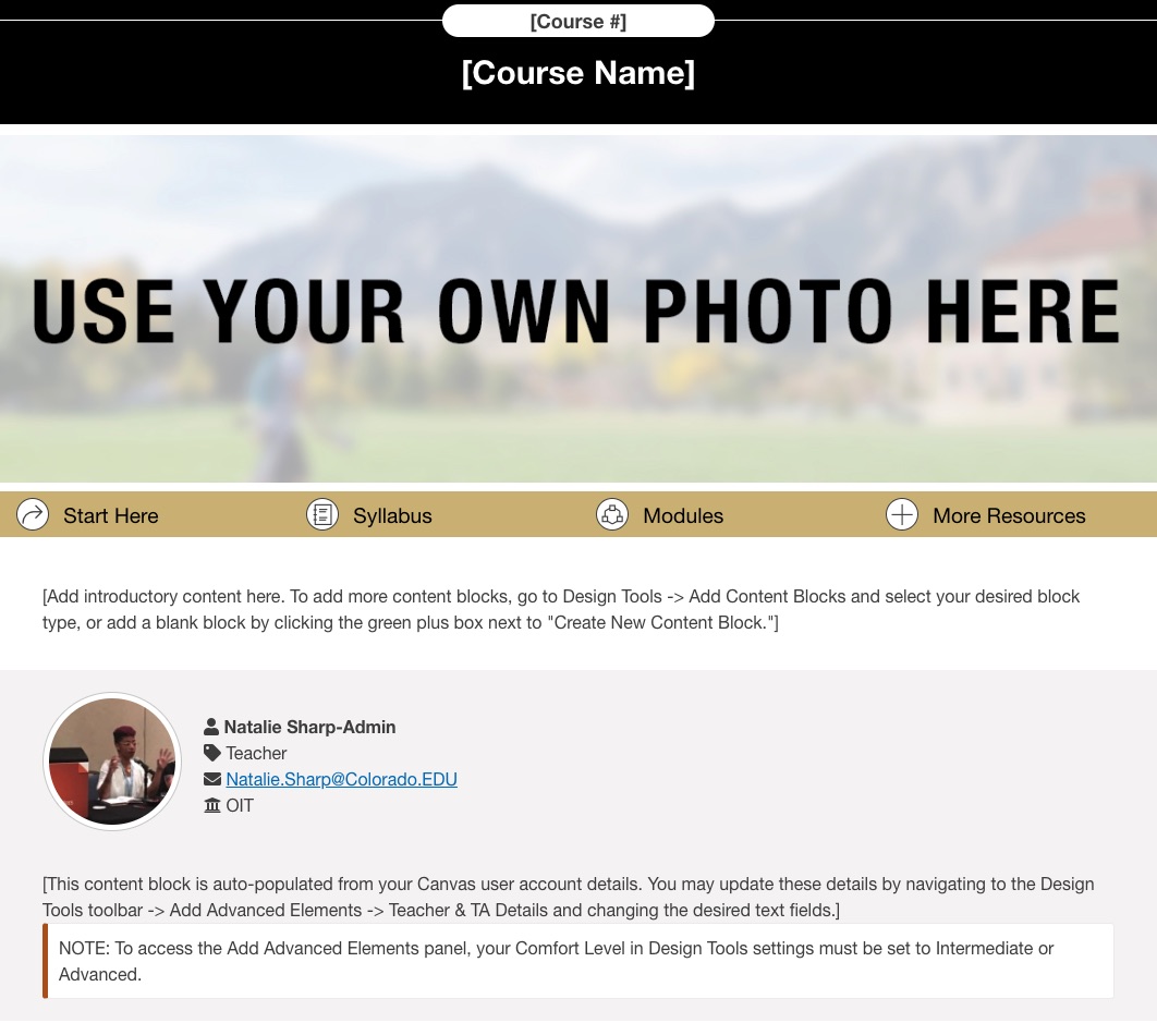
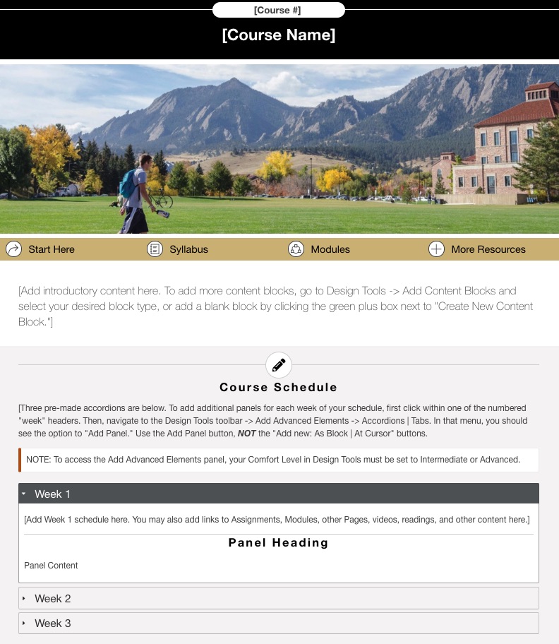
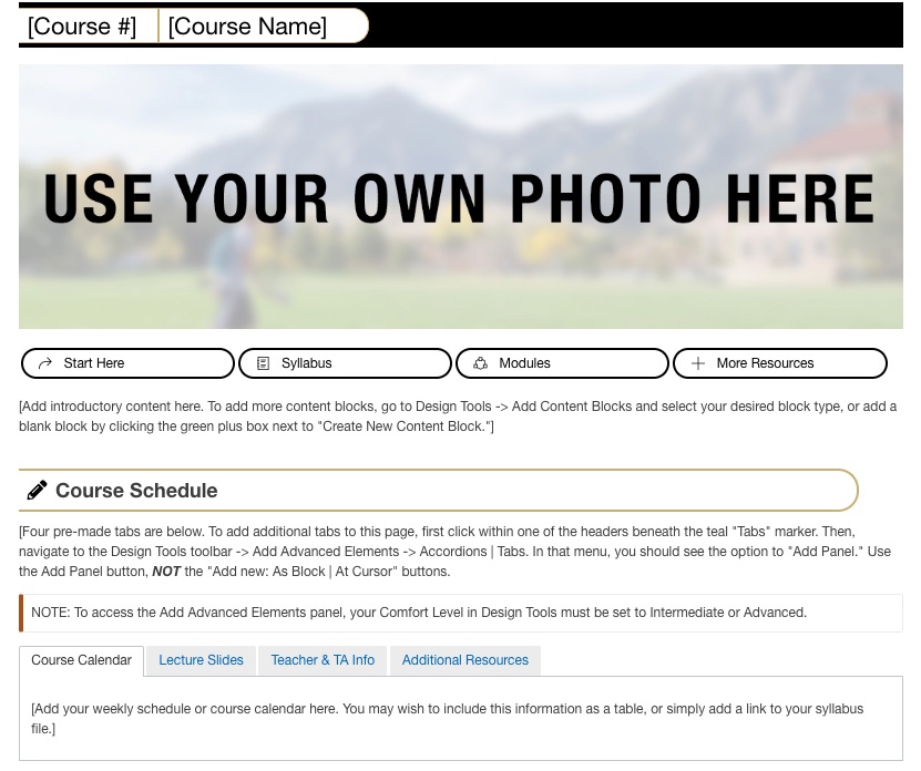
As a result of the above mentioned Cidi Labs Template Design & User Testing project, we developed three course homepage templates for CU Boulder Canvas courses. Preview the templates below.
How to Access Templates
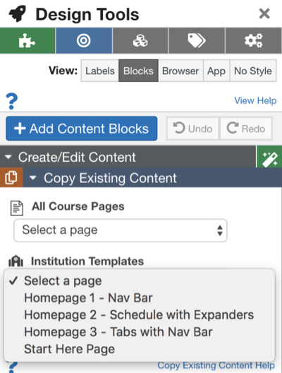
When in Cidi Labs, go to the Create/Edit Content menu. From there, expand Copy Existing Content and click on the Institutional Templates drop-down menu.
Accessibility Features
Cidi Labs offers several accessibility features to help you create universally designed courses, including a Heading structure checker, image/alt text checker, link checker and a color contrast checker. The Cidi Labs and Accessibility guide provides more information on how each tool works.
Support Resources
Content Editor Toolbox "Get Help" panel

From the "Get Help" panel in the Content Editor Toolbox, you can access several resources created by Cidi Labs. The Cidi Labs User Guide Canvas Course uses modules and content pages to guide you through each Design Tools feature. From the "Get Help" panel, you can also send your questions and feature requests directly to Cidi Labs via email at support@cidilabs.com.
ATC Consultations and Trainings
Academic Technology Consultants in OIT are available to offer individual and group instruction on using Cidi Labs Design Tools.
- Request a consultation with an Academic Technology Consultant (ATC). ATCs can meet with you online via Zoom or come to your office to help you learn to use Design Tools.
- Attend an upcoming Cidi Labs Design Tools training or request a training session for your department.
OIT made this tool available campus-wide based on positive feedback and recommendations from faculty participants in the Cidi Labs Design Tools pilot during Fall 2018.
